9 Signs of Poor Digital Experience That the Best CE Teams Always Avoid
Your website is the front door into, and the shop window for, your continuing ed division. The best CE and workforce development websites are designed with this in mind.
Unfortunately, limited by software not designed for the needs of modern CE departments and the modern learners they serve, CE departments across North America can wind up settling for a subpar web and e-commerce experience.
Even more troubling? The gaps aren’t always noticed by CE and workforce development leaders.
“Good enough” isn’t good enough for the modern learner, or for your modern non-traditional division.
If you’re a continuing ed leader, open a second browser window and check your website for these nine signs that your digital experience needs an update.
1. Your CE Program Pages Don’t Live on Your Website
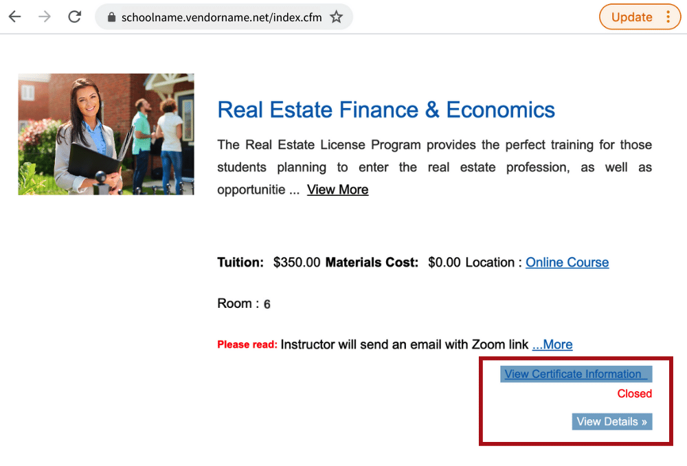
Take a look at the URL when you open your course catalog and registration pages. Does it resemble this?

If so, when students click on any of your program pages, they’re taken out of the CE program’s website and onto the software provider’s site to find and register for the offering they want.
This means your institution loses SEO value from the keywords embedded on the program and course pages, and—critically—loses prospective student web traffic. When 57% of today’s incoming students use search engines to find college websites (according to the most recent Ruffalo Noel-Levitz E-Expectations data) this poses a major threat to your unit’s growth.
You need a modern continuing education platform that knows the value of SEO to your institution and keeps valuable catalog and course pages on your website (not the vendor’s).
2. Your CE Website Has 404 Errors
Occasionally, a hyperlink will become outdated because of changes happening elsewhere on the website. But on outdated platforms—especially not those designed with complex higher ed institutions in mind—those links often get overlooked.
As a result, many college websites will wind up showing 404 errors whenever a prospective student tries to click on a link.
Not only will this frustrate your website visitors, 404 errors frustrate Google. If Google crawls your website and finds 404 errors, it’s likely that your search ranking will drop.
You need to find and address 404 errors to ensure students can always find what they’re looking for, and explore tools that ensure hyperlinks are always active and accurate.
3. Your CE Website Doesn’t Automate the Waitlist Process
The waitlist can be an incredibly powerful feature for modern colleges and universities. It allows students to indicate an active interest in a course or program—providing valuable market data on demand—and ensures your courses will have every seat (physical or virtual!) filled.
But many CE divisions don’t offer waitlist access, and for those who do, it can be a highly manual process that relies on staff to work. And frankly, that additional strain on staff will generally push schools to consider giving up on waitlists altogether.
If you’re not offering waitlists, though, your CE department is voluntarily reducing its capacity to create access and generate revenue. You’re choosing to serve fewer students per course, driving up costs and hampering your mission.
You need to explore class registration software that allows you to automate waitlist management, to ensure you’re maximizing access to every CE course you offer.
4. Your CE Website Has Typos
As an institution of higher learning, charged with educating, upskilling and reskilling individuals, a typo on a webpage is a bad look.
No matter how understandable it is—you have overworked staff trying to make sure web copy is up-to-date, and likely entering the same data in five different places—spelling and grammar errors don’t reflect well on your school.
Students need to trust their higher education institutions, and part of that trust stems from the digital experience and engagement you offer. Every part of your website needs to reflect your brand and your promise to learners.
You need to ensure you can quickly and efficiently scan your entire website for spelling and grammar issues. You also need to simplify the process of updating content across your CE website.
5. Your CE Website Doesn’t Alert Students When They Can Register for a Course
Students—especially those looking for just-in-time learning opportunities—think and act like consumers. They search for programs based on the promise and outcomes, they’re influenced by great higher education website design, and they look for the e-commerce best-practices offered by major corporations.
If you have a course or program that perfectly fits their needs—but registration is not yet open—they’re not going to bookmark the page and set a reminder for themselves to come back later. They’ll likely forget about your offering and look elsewhere instead.

As you can see from this program page, a great offering is currently closed. But there’s no option for the student to be alerted when registration for the course opens again. This results in students losing interest and forgetting about the offering, which means the division will be challenged to ensure it meets its enrollment and revenue target from this course.
You need a CE student management system that delivers an automated “remind me” feature so students can be alerted when registration opens for courses and programs.
6. Your CE Website Makes Discounts Complicated (or Impossible)
Price discounts are one of the most effective drivers for customer engagement in any industry. But in continuing education, it’s often difficult for students to apply discounts when they’re registering and paying online.
Most continuing education management software offers a basic “find course à pay for course” functionality, but doesn't go any further. As a result, if a student wants to apply a discount, they either have to register by phone or in-person—or they need to register at full price online, then call or visit the office to have their discount amount refunded.
That is a bad customer experience.
Delivering a modern digital engagement experience to students requires a modern website with a modern checkout process that can handle discount codes.
You need a CE checkout process that allows students to apply their discount codes while they’re registering and paying on the website.
7. Your CE Website Isn’t Fully Accessible
Ensuring your website is compliant with accessibility standards is critical in the 21st Century. It’s not just the right thing to do—and it’s not just a legal obligation: maintaining compliance with ADA and WCAG 2.1 Level AA accessibility standards ensures that you’re able to provide a high-quality digital experience to every student coming to your door.
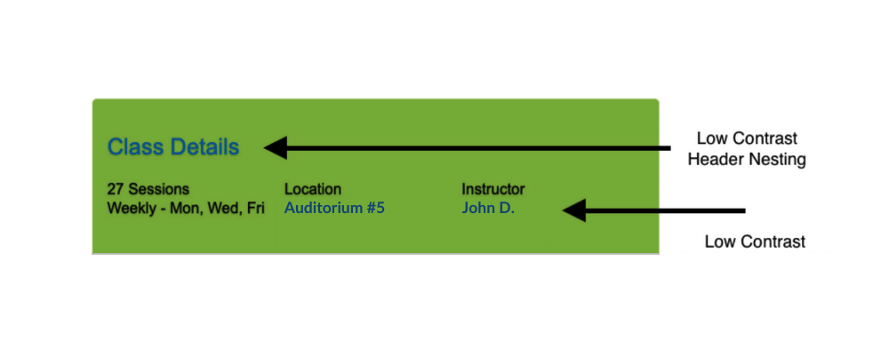
Check out this screenshot from a course page where accessibility hasn’t been considered:

While these colors align with the institution’s brand, an accessibility check would have flagged this as difficult to read so that it could have been addressed before going live.
Your website should represent the best of your institution at every phase—from content to navigation to user experience. Accessibility needs to be a top-of-mind consideration, especially in higher education.
You need a continuing education platform that keeps accessibility compliance top-of-mind and easy to manage.
8. Your CE Website Isn’t Mobile-Friendly
It’s not 2001. Today’s consumer doesn't park themselves in front of their family desktop in the computer room to do their online shopping anymore. In fact, over 14% of e-commerce sales in 2020 were conducted on mobile devices, and that number is expected to rise to 18% (representing over $1T in sales) by 2024.
Unlock your smartphone and visit your CE division’s website. Now grab your tablet and do the same. Is the content and layout formatted specifically for each device?
CE websites need to be fully mobile responsive and optimized to be viewed on any device so that prospective students can browse your offerings at their convenience—whether they’re taking their kids to soccer practice, commuting, or sitting on the couch.
What’s more, your checkout experience needs to be dynamic, to meet prospective registrants where they are. Students should be able to add items to their cart, and then log into the profile on the computer to complete their purchase.
Your CE website experience should be dynamic and responsive to the full array of devices modern customers use every day.
9. Your CE Shopping Cart is Basic
- Find item
- Place item in cart
- Purchase item
There’s more to a digital shopping experience than these three steps. But for many continuing ed institutions, this is the entirety of the digital engagement experience they offer through their website shopping carts.
Your CE shopping cart should go way beyond those three steps. It should provide visual cues that remind students what they’re buying, allow students to save items for later, persist across multiple devices and remind them when they’ve left items in the cart without paying.
In short, your shopping cart should mirror your website in providing a student-centric, highly engaging experience that reflects your commitment to learner success.
Your CE unit needs to offer a registration experience that mirrors the checkout best practices of e-commerce leaders.
Your Call to Action
Your CE students have high expectations for your school’s website. Whether they’re 27 or 57, the modern learner is an experienced consumer who shops online regularly.
Your school’s digital experience must reflect the institution’s brand, its vision and its commitment to student-centricity. It is possible. Be sure your CE unit avoids these eight signs of trouble and instead sets itself apart as one of the best digital experiences in continuing education.
Modern Campus Destiny One: #1 SIS for Non-Traditional Education
Destiny One is the #1 solution to manage the business of continuing education and workforce development for schools of all sizes and types.
Last updated: April 27, 2021
